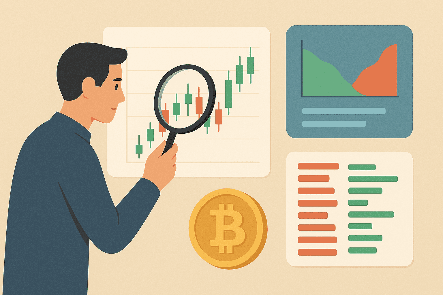
Crypto charts are a visual record of price over time. In most charting interfaces, the X-axis represents time and the Y-axis represents price, and the chart redraws using the timeframe you select (for example, 5 minutes vs 1 hour vs 1 day). Because crypto markets trade continuously, charting “days” typically roll over at 00:00:00 UTC, which can affect how candles are grouped. To read a chart, you first identify the chart type (line, candlestick, or bar/OHLC), then assess the overall direction, and finally use support/resistance plus confirmation tools such as volume and indicators before planning an entry and exit with a predefined stop-loss.
How to Read Any Crypto Chart (Practical Workflow)
- Choose a timeframe that matches your intent (minutes/days for shorter-term, weeks for broader swings).
- Confirm the chart type so you interpret the right price information (closing price on a line chart, full OHLC data on candles/bars).
- Identify the market structure: check whether recent swing highs/lows are forming higher highs and higher lows (uptrend), lower highs and lower lows (downtrend), or roughly equal highs/lows within a sideways range (consolidation).
- Mark support and resistance zones where price repeatedly reacts, then watch how candles/bars behave as they approach those levels.
- Validate with volume and indicators (for example, stronger moves often coincide with rising volume, and some indicators can confirm momentum or weakening).
- Plan the trade rules: define the entry trigger (e.g., pullback holds support), the invalidation level for the stop-loss, and the exit target (often prior resistance or the next key level).
Price Charts: Line, Candlestick, and Bar (OHLC)
- Line chart connects closing prices over time for a high-level view.
- Candlestick chart shows open, high, low, and close for each interval, highlighting the intraperiod range.
- Bar chart (OHLC) also displays open, high, low, and close for each interval, but without candle bodies—using simple lines instead.
| Chart Type | Data Shown | Best Use Case |
|---|---|---|
| Line chart | Closing price across time | Quickly reading direction and comparing overall movement |
| Candlestick chart | Open, high, low, close (body + wicks) | Detailed price action and pattern reading |
| Bar chart (OHLC) | Open, high, low, close (using lines/ticks) | OHLC analysis in a simpler visual format |
Price Line Chart
The simplest view is the line chart, which connects the market’s closing price over a chosen period to show direction at a glance. Two scales are common: a linear scale, where equal vertical steps represent equal currency units, and a logarithmic scale, where equal steps represent equal percentage change. Linear scaling highlights the pace of moves, while log scaling clarifies the broader trend—useful when price changes by very different magnitudes across time.
Linear Scale (Bitcoin Price)
Logarithmic Scale (Bitcoin Price)
Exchanges frequently display a volume panel beneath price. Those columns measure how many coins changed hands in each interval—do not confuse this with market capitalization. In technical analysis, volume is often used as a gauge of participation: a move supported by heavier turnover may be more credible, while price changes on weak activity can be less convincing.
Candlestick Chart
Candlesticks show more detail than a line chart by plotting four data points per period: open, high, low, and close. This view makes it easier to see the intraperiod range, including how far price traveled and where it ultimately closed.
One candle represents exactly one selected interval—on a 5-minute chart each candle covers 5 minutes, and on a 1-day chart each candle covers one day. Each candle has three main visual parts: the body, the upper wick, and the lower wick. The upper wick marks the session high, the lower wick marks the session low, and the body spans from open to close; if the open or close matches the extreme, a wick on that side may be absent.
Color coding (such as green for bullish and red for bearish) helps you scan direction quickly. A green body typically means the close is above the open for that interval, while a red body means the close is below the open. The specific “time windows” or colors can vary by platform, but the underlying meaning of the OHLC fields stays consistent.
For example, suppose a 1-hour candle has an open of $50,000, a high of $51,200, a low of $49,600, and a close of $50,900. In that case, the body spans from $50,000 to $50,900, the upper wick extends to $51,200, and the lower wick extends to $49,600—so you can tell both where price went and how it ended.
- Hammer (bullish reversal): often appears after a decline, with a small body and a long lower wick.
- Inverted Hammer (bullish reversal): similar concept, but the long wick is on the top side after selling pressure.
- Hanging Man (bearish reversal): resembles a hammer after an uptrend and can indicate that upward momentum is fading.
- Shooting Star (bearish reversal): typically follows an upswing and shows a small body with a long upper wick.
- Doji (indecision/possible continuation or reversal): forms when open and close are nearly equal, reflecting a tug-of-war during the interval.
Candle shapes matter most in context. As you gain experience, compare two- and three-candle sequences to the surrounding swing highs/lows, and look for confirmation at support/resistance rather than treating patterns as stand-alone signals.
While exploring exchange charts, you will also notice colored lines drawn over price. These overlays are usually moving averages calculated from recent closing prices, which are used to smooth noise and help gauge trend direction.
| Moving Average Period | Purpose/Use |
|---|---|
| 7 sessions | Tracks short-term momentum and quick shifts in direction. |
| 25 sessions | Highlights the mid-term trend and helps filter out minor noise. |
| 99 sessions | Shows the broader trend and can act as dynamic support or resistance for longer moves. |
Bar Chart (OHLC Chart)
A bar chart (often called an OHLC chart) shows the open, high, low, and close for each interval using simple lines or ticks rather than candle bodies. In many layouts, the left side tick or marker represents the open, the right side tick or marker represents the close, the top of the bar marks the high, and the bottom marks the low. Conceptually, a bar chart conveys the same price information as candlesticks; the difference is the visual format, which some traders find easier to scan.
Example (1-hour OHLC bar): open at 50,000, high at 51,200, low at 49,600, and close at 50,900. The high and low show the full range reached during the hour, while the open/close positioning shows whether the interval ended toward the upper or lower part of that range.
Depth of Market Chart
A depth chart visualizes real-time supply and demand. The green side aggregates buy orders (bids) and the red side aggregates sell orders (asks) near the current price; where the two curves meet reflects the latest traded level. Hovering over any point typically shows the quantity available (vertical axis) at a specific price (horizontal axis).
Order walls and slopes change quickly as bids and asks are placed or canceled. When cumulative buy interest outweighs sell interest, upward pressure on price is more likely, and the opposite is true when sell orders dominate.
Next to the depth view, most platforms show an order book—a live ledger of outstanding buy and sell instructions.
Buy orders (bids) are typically listed in green below the last traded price, while sell orders (asks) are shown in red above it. Displays may vary across exchanges, but the underlying principles remain the same.
Indicators: Moving Averages, SMA, and RSI
Moving averages and momentum indicators are often used to confirm what your chart structure suggests. Moving averages smooth price by averaging data over a chosen lookback period, while oscillators such as RSI aim to quantify momentum and potential overextension.
Simple Moving Average (SMA): What It Suggests and How to Use It
A Simple Moving Average (SMA) is the average closing price over a defined number of periods. For instance, a 50-day SMA calculates the average of the last 50 daily closes. Traders often interpret it in two practical ways: (1) relative position of price versus the SMA, and (2) direction of the SMA itself.
- Price above the SMA: suggests price is trading in the direction of the prevailing average; some traders use this as a bias for long setups.
- Price below the SMA: suggests price is trading under the prevailing average; some traders use this as a bias for short setups or caution on longs.
- Rising SMA: typically aligns with strengthening upward trend conditions.
- Falling SMA: typically aligns with weakening conditions or a downtrend bias.
Example: If a 50-day SMA has been rising and price pulls back to it but closes back above the SMA, that behavior can act as confirmation for a trend-continuation style plan—provided the move also respects nearby support.
Relative Strength Index (RSI): Thresholds and Plain-Language Meaning
The Relative Strength Index (RSI) is a momentum oscillator that ranges from 0 to 100. It compares recent gains to recent losses over a set period. A common beginner interpretation uses these thresholds: RSI above 70 can indicate the asset may be overbought, while RSI below 30 can indicate it may be oversold.
- RSI > 70: price may be extended; traders often look for signs of weakening momentum near resistance rather than assuming an automatic reversal.
- RSI < 30: price may be depressed; traders often watch for stabilization and improving momentum near support.
- RSI moving upward while price holds support: can suggest momentum is returning, supporting a long-biased scenario.
- RSI rolling over while price approaches resistance: can suggest momentum is fading, supporting a short-biased or caution scenario.
Example: If the market is in a downtrend (lower highs and lower lows) and RSI rises above 50 but then fails to progress further as price hits a resistance zone, that combination can be used as a confirmation to avoid longs or to wait for a clearer breakdown.
What Are the Different Types of Crypto Chart Patterns, and How Do They Work?
Patterns can show up as single-candle signals, multi-candle structures, or broader formations built over multiple swings. A key rule is that patterns are probabilistic: they often perform better when they appear in the “right” context—such as near support/resistance or after a recognizable trend transition—and when you confirm with volume and/or momentum tools.
In practice, traders commonly interpret patterns using a simple framework: location (where it appears), structure (what the candles/bars indicate), confirmation (what volume/indicators say), and invalidation (what price movement would prove the idea wrong).
Conclusion
Reading cryptocurrency charts is a foundational skill for any trader. The visuals covered here—price lines, candlesticks, moving averages, market depth, and the order book—give you a practical starting point for building strategies, testing ideas, and improving decision-making.
If you are wondering when crypto will rise or fall, charts can help you form a probability-based view, not a guarantee. Traders typically look for confluence—such as trend direction, support and resistance reactions, volume confirmation, and indicator signals (for example, RSI, MACD, or moving-average behavior)—while keeping in mind that unexpected news, macro moves, liquidation events, and exchange-specific liquidity can override even clean setups.
Chart-based trading also has real risks and limitations. Technical signals can lag, markets can whip back and forth and trigger false breakouts, and low-liquidity conditions can distort patterns and indicators. It is also easy to overfit a strategy to past price action or to ignore broader context like fundamentals, sentiment, and changing market structure.
Effective chart reading works best when it is paired with disciplined risk management and cross-checked against other research, because no single indicator can fully explain a fast-moving market.
To practice safely, many beginners start with paper trading or simulation tools so they can place “trades” without risking real funds. Some exchanges offer demo accounts, and charting platforms like TradingView include paper trading features that let you test entries, exits, and position sizing while you learn how different timeframes and conditions affect results.
For apps and platforms, most traders rely on a mix of charting tools and exchange interfaces. TradingView is widely used for advanced charting, indicators, and alerts, while CoinMarketCap and CoinGecko are common for quick price checks and broad market overviews. Major exchanges such as Binance, Coinbase Advanced, and Kraken provide integrated charts plus order books and depth views, which can be helpful when you want to connect chart signals to real execution.
FAQ
What Is a Line Price Chart?
A line chart connects closing prices across time, offering a clean view of overall direction in a selected timeframe.
What Is a Candlestick Chart?
A candlestick plots open, high, low, and close for each interval, revealing intraperiod range, wicks, and momentum more clearly than a simple line.
What Is a Market Depth Chart?
A market depth chart maps aggregated buy (green) and sell (red) orders near the current price to visualize short-term supply and demand.