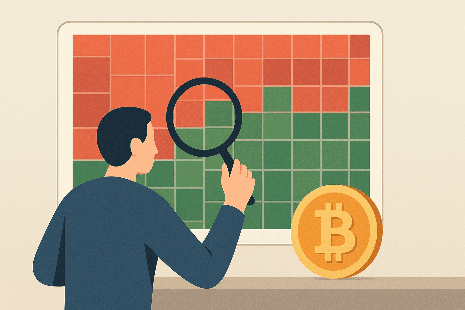
A crypto heatmap is a grid-based visualization of multiple cryptocurrencies where each tile represents one asset, color reflects its price change over a selected timeframe, and tile size often corresponds to market-cap weighting. The value of a heatmap is that it compresses market-wide movement into a quick, comparable view—making it easier to spot breadth (how many assets are moving), relative strength, and potential inflection points without scanning coin-by-coin charts.
Background and Origins
This visualization style draws from traditional finance heatmaps used to show market breadth and direction across stocks. During the 2010s, crypto-focused platforms adopted a similar approach to present coin price action and prevailing conditions in a format that users could scan rapidly.
Practical Uses and Functions
Its main job is fast market-wide interpretation. In most implementations, green tiles indicate upward price movement and red tiles indicate downward movement; the intensity of the shade can reflect the magnitude of the change. Gray or neutral tones typically represent smaller moves. Timeframe selection (for example, hourly versus daily) changes what “direction” and “magnitude” mean, while tile size often conveys market-cap weight—so large-cap assets can visually dominate the overall grid. If available, volume may appear through filters, tooltips, or overlays; unusually high volume can help distinguish a move with broad participation from one driven by thin liquidity.
Many users rely on heatmaps for tasks such as identifying relative strength (which assets or sectors are leading), comparing large-cap versus mid-cap movers by reading tile size, and focusing on moves with supportive volume. When colors shift sharply on live views, it can serve as an early cue for sudden surges, sharp reversals, or sector rotation—follow-up analysis with a candlestick chart and an order book is typically needed before acting.
A heatmap is most useful when you read it as layers: color shows direction and magnitude, tile size hints at market-cap weight, and volume confirms whether a move is backed by meaningful trading activity.
Additional advantages include:
- Surfacing coins with unusual momentum for follow-up review
- Highlighting recurring rotations and market-cycle behavior
- Providing a quick overview of broad market health, not just individual price action
How Live Crypto Heatmaps Help in Real Time
When a heatmap is updated continuously, it can reveal changes that are easy to miss when reviewing isolated charts. Common signals include:
- Broad risk-on/risk-off shifts: many tiles turning green or red at once can indicate market-wide positioning changes.
- Large-cap weakness or strength: if the biggest tiles move first or move most, it may signal leadership from major assets.
- Sudden sector or theme rotation: clusters of related coins turning in the same direction can suggest a rotation rather than a random spread.
- Magnitude expansion: rapidly deepening shades can indicate acceleration in price changes.
- Volume-backed breakouts (when shown): color changes accompanied by higher volume can point to stronger participation.
- Reversal signals: quick transitions from red to green (or vice versa) across the grid can reflect turning conditions.
Example scenarios:
- If most large-cap tiles turn green while mid- and small-cap tiles lag, the heatmap is signaling top-weighted strength; traders often follow this by checking candlestick structure for those leading assets.
- If a narrow group of tiles turns green while the rest of the market stays mixed, it may indicate isolated sector leadership; users typically validate whether the move persists by comparing volume and subsequent price action.
What a live heatmap cannot confirm on its own: it does not guarantee that a move will continue, and it cannot fully explain why demand or selling pressure changed. Follow-up checks—such as candlestick charts, order books, and (where relevant) on-chain or liquidity indicators—help verify context.
Market and Investment Impact
By translating dense price movements into intuitive colors, these dashboards reduce the effort needed to scan the market, which can be useful for newcomers and for experienced users monitoring breadth. They may shape how people build watchlists or frame scenarios, but they remain only one input among many.
Because the grid reflects a collective snapshot, sentiment is often visible as a distribution of colors. Widespread green across major tiles commonly aligns with bullish risk-on behavior, while broad red—especially in large-cap tiles—often aligns with risk-off conditions. The display can also echo changes in total crypto market capitalization: rising green concentration among higher-weight tiles is more consistent with market-cap growth, whereas broad declines in those tiles tend to accompany shrinking overall market value.
Current Trends and Innovations
As digital-asset markets mature, heatmap tools are expanding timeframe options, adding derivatives-related views, and covering a wider range of altcoins. Some also incorporate additional signals alongside price movement to provide a more complete picture, with optional overlays for depth and volume where the platform supports it.
Traders sometimes pair heatmap readings with sentiment gauges such as the Fear and Greed Index, which summarizes broader market psychology. Heatmaps typically do not “include” that index, but they can reflect similar mood shifts through changes in color breadth; used together, they can help contextualize whether a green or red grid is occurring during heightened optimism or caution.
Other common crypto market visualization tools include:
- Candlestick charts, which show price action over time with open, high, low, and close.
- Order books, which display current buy and sell orders to gauge immediate supply and demand.
- Depth charts, which visualize order-book liquidity across price levels to highlight potential support and resistance zones.
- On-chain analytics dashboards, which track network activity such as addresses, flows, and holder behavior.
| Tool | Primary use | Strengths | Limitations |
|---|---|---|---|
| Crypto heatmap | Market breadth and relative movement across many assets | Quick scanning of color breadth, magnitude cues, and (often) market-cap weighting in one view | Requires follow-up to confirm drivers; a color move alone does not validate direction or sustainability |
| Candlestick chart | Price behavior over time for a specific asset | Shows structure and timing (open/high/low/close) for entries or exits | Not designed for fast cross-market comparison across dozens of assets at once |
| Order book | Immediate liquidity and order-flow snapshot | Helps assess near-term buying/selling pressure | Can change quickly; it may not reflect longer-term market direction without additional context |
| Depth chart | Liquidity distribution across price levels | Highlights where liquidity clusters, which can inform support/resistance expectations | Does not inherently indicate whether the market will move through those levels |
| On-chain dashboard | Network-level activity and participation trends | Provides fundamental context that price-only views may miss | Signals can lag or be indirect; it typically does not replace price action for short-term timing |
Conclusion
In short, a crypto heatmap is a practical lens for interpreting digital-asset moves across many markets at once. It helps clarify breadth and relative leadership so users can monitor conditions efficiently. Treat it as guidance rather than a guarantee: volatility and liquidity conditions can diverge from what a color grid suggests, so confirmation with supporting tools is usually necessary.