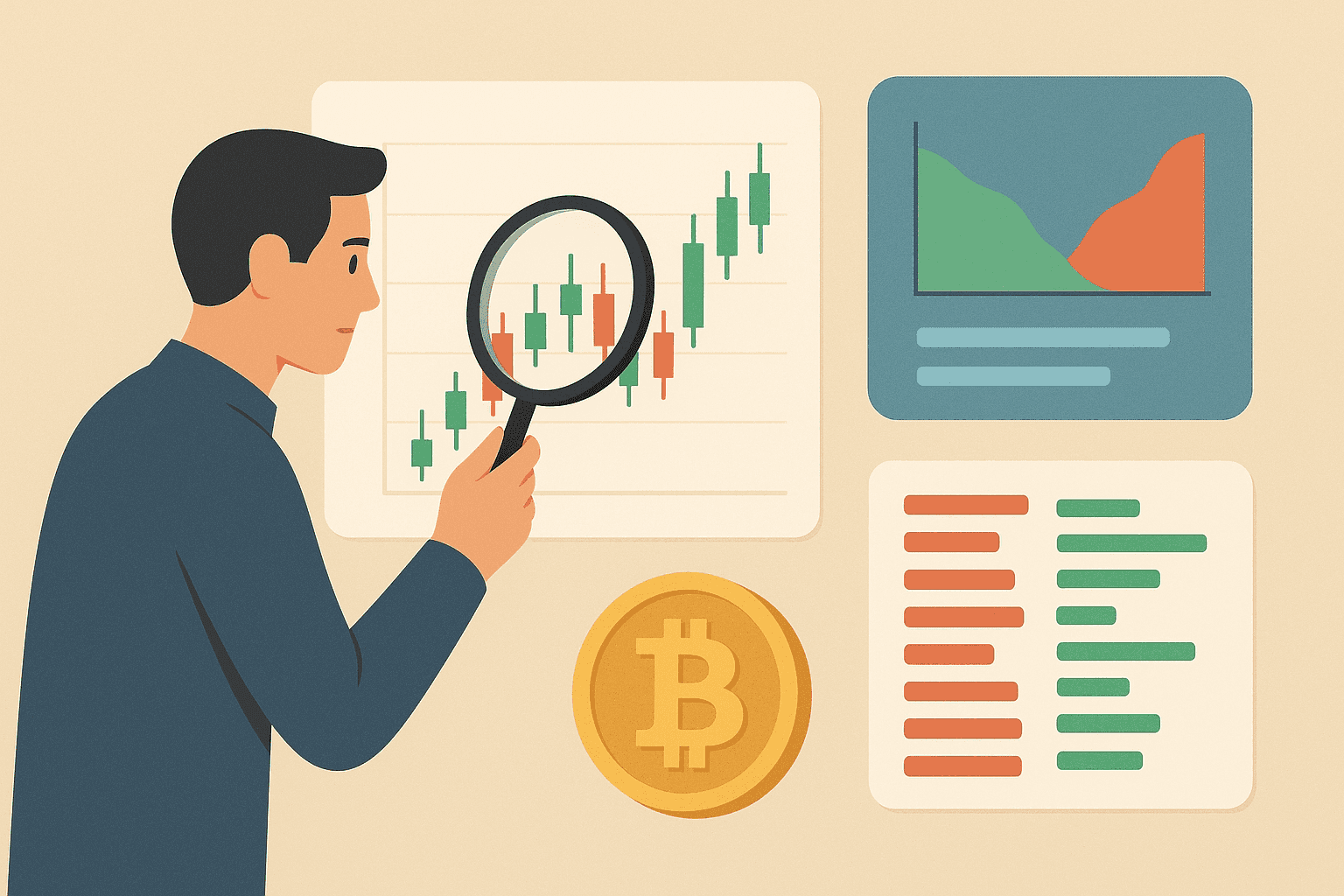
If you want to learn to interpret crypto charts, start with technical analysis. Instead of trusting luck, traders rely on chart-based evidence to make consistent decisions. Because price and volume drive most outcomes, exchanges present a range of visuals that map these dynamics; below we outline the most common cryptocurrency charts and the tools traders consult every day. In practice, traders often follow a simple workflow: choose a timeframe that matches the trade (minutes for short-term, days/weeks for longer-term), identify the prevailing trend, mark key support and resistance zones, then confirm what they see with volume and one or two indicators. From there, they plan an entry and exit (for example, buying after a pullback that holds support and shows renewed strength) and set risk controls like a stop-loss before placing the trade.
Price Line Chart
The simplest view is the line chart, which traces the market’s closing price over a chosen period to show direction at a glance. Two scales are common: a linear scale, where equal vertical steps represent equal currency units, and a logarithmic scale, where equal steps show equal percentage change. Linear scaling highlights the pace of moves, while log scaling clarifies the broader trend—experienced traders often compare both for balanced chart analysis.
Linear Scale (Bitcoin Price)
Logarithmic Scale (Bitcoin Price)
Exchanges frequently display a volume panel beneath price. Those columns measure how many coins changed hands in each interval—do not confuse this with market capitalization. In technical analysis, volume is a core indicator of price strength: rising prices confirmed by heavy turnover can point to continuation, whereas a decline on thin activity suggests muted participation.
Candlestick Chart
Candlesticks capture more detail than a line chart by plotting four data points per period: open, high, low, and close. This compact view of price action (including intraperiod range) is why most crypto traders prefer candles for day-to-day chart analysis.
Each candle has three components: an upper wick, a lower wick, and the body. The top wick marks the session high, the bottom wick marks the low, and the body spans from open to close. Sometimes a candle shows no wick on one side (or either side) when the open or close equals the period’s extreme.
Color coding makes sentiment obvious. A green body signals a bullish period (close above open); a red body shows a bearish period (close below open) for the selected timeframe. On TradeSanta, for example, you can choose among six windows ranging from 6 hours to 1 week.
Candle shapes and multi-candle combinations help flag trend turns.
- Hammer (bullish reversal): Often appears near the end of a downtrend, with a small body and a long lower wick.
- Inverted Hammer (bullish reversal): Can form after declines and suggest buyers are starting to push back.
- Hanging Man (bearish reversal): A hammer-like shape after an uptrend that can warn buying pressure is fading.
- Shooting Star (bearish reversal): Typically appears after an upswing, with a small body and a long upper wick that can hint at a potential top.
- Doji (indecision/continuation): Forms when the open and close are nearly equal, signaling a tug-of-war that can precede either continuation or reversal.
As you gain experience, study two- and three-candle patterns to sharpen forecasts of the next likely price move.
While exploring exchange charts, you will also notice colored lines drawn over price.
These overlays are moving averages calculated from recent closing prices.
| Moving Average Period | Purpose/Use |
|---|---|
| 7 sessions | Tracks short-term momentum and quick shifts in direction. |
| 25 sessions | Highlights the mid-term trend and helps filter out minor noise. |
| 99 sessions | Shows the broader trend and can act as dynamic support or resistance for longer moves. |
Depth of Market Chart
A depth chart visualizes real-time supply and demand. The green side aggregates buy orders (bids) and the red side aggregates sell orders (asks) near the current price; where the two curves meet reflects the latest traded level. Hovering over any point typically shows the quantity available (vertical axis) at a specific price (horizontal axis).
Order walls and slopes change quickly as bids and asks are placed or canceled. When cumulative buy interest outweighs sell interest, upward pressure on price is more likely, and the opposite is true when sell orders dominate.
Next to the depth view, most platforms show an order book—a live ledger of outstanding buy and sell instructions.
Buy orders (bids) are typically listed in green below the last traded price, while sell orders (asks) are shown in red above it. Displays may vary across exchanges, but the underlying principles remain the same.
Conclusion
Reading cryptocurrency charts is a foundational skill for any trader. The visuals covered here—price lines, candlesticks, moving averages, market depth, and the order book—offer a practical starting point for building strategies, testing ideas, and improving decision-making.
If you are wondering when crypto will rise or fall, charts can help you form a probability-based view, not a guarantee. Traders typically look for confluence—such as trend direction, support and resistance reactions, volume confirmation, and indicator signals (for example, RSI, MACD, or moving-average crossovers)—while keeping in mind that unexpected news, macro moves, liquidation events, and exchange-specific liquidity can override even clean setups.
Chart-based trading also has real risks and limitations. Technical signals can lag, markets can whip back and forth and trigger false breakouts, and low-liquidity conditions can distort patterns and indicators. It is also easy to overfit a strategy to past price action or to ignore broader context like fundamentals, sentiment, and changing market structure.
Effective chart reading works best when it is paired with disciplined risk management and cross-checked against other research, because no single indicator can fully explain a fast-moving market.
To practice safely, many beginners start with paper trading or simulation tools so they can place “trades” without risking real funds. Some exchanges offer demo accounts, and charting platforms like TradingView include paper trading features that let you test entries, exits, and position sizing while you learn how different timeframes and conditions affect results.
For apps and platforms, most traders rely on a mix of charting tools and exchange interfaces. TradingView is widely used for advanced charting, indicators, and alerts, while CoinMarketCap and CoinGecko are common for quick price checks and broad market overviews. Major exchanges such as Binance, Coinbase Advanced, and Kraken provide integrated charts plus order books and depth views, which can be helpful when you want to connect chart signals to real execution.
FAQ
What Is a Line Price Chart?
A line chart connects closing prices across time, offering a clean view of overall direction in a selected timeframe.
What Is a Candlestick Chart?
A candlestick plots open, high, low, and close for each interval, revealing intraperiod range, wicks, and momentum more clearly than a simple line.
What Is a Market Depth Chart?
A market depth chart maps aggregated buy (green) and sell (red) orders near the current price to visualize short-term supply and demand.