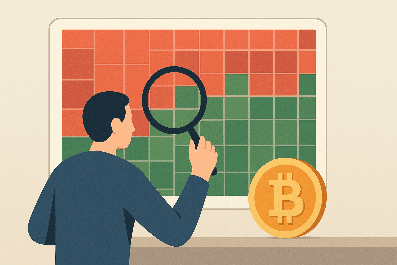
A crypto-market heatmap condenses price changes into a color-coded view, spanning intervals from hourly snapshots to year-over-year shifts. By surfacing movement across the crypto market at a glance, it helps investors, traders, and researchers quickly assess conditions and potential opportunities.
Background and Origins
This visualization style traces its roots to traditional finance and stock trading, where heatmaps have long illustrated market breadth and direction. During the 2010s, crypto-focused platforms adopted the approach to present coin price action and prevailing conditions in a concise, easily scanned format.
Practical Uses and Functions
Its core role is rapid sentiment reading. Broad fields of green suggest upward momentum, while predominately red tiles point to a bearish phase. Many heatmaps also use stronger or darker shades to indicate larger percentage moves, with neutral tones (such as gray) signaling minimal change. Tile size commonly reflects market capitalization, so larger blocks tend to represent higher-cap assets and can heavily influence the “feel” of the overall grid. Trading volume is often available via filters, tooltips, or overlays; unusually high volume can help validate that a price move has real participation behind it rather than thin liquidity.
That instant snapshot can support more informed allocation and trading decisions: traders can scan for relative strength (which assets or sectors are outperforming), isolate large-cap vs. mid-cap movers by comparing tile size, and filter by volume to spot moves that may be more actionable. On live views, abrupt color shifts can flag sudden surges, sharp reversals, or sector rotations worth investigating immediately with a candlestick chart and order book before placing or adjusting orders.
A heatmap is most useful when you read it as layers: color shows direction and magnitude, tile size hints at market-cap weight, and volume confirms whether a move is backed by meaningful trading activity.
Additional advantages include:
- Surfacing coins drawing momentum and interest for further review
- Revealing recurring patterns, rotations, and market cycles
- Providing a quick overview of overall market health
Market and Investment Impact
By translating dense price data into intuitive colors, these dashboards lower the learning curve and make analysis more accessible, especially for newcomers. They broaden participation in crypto market research and can influence watchlists and strategy, though they remain just one input among many.
Because the grid is a collective snapshot, market sentiment often shows up as the distribution of colors: widespread green across major tiles typically aligns with bullish risk-on behavior, while broad red—especially concentrated in large-cap tiles—often reflects risk-off conditions. In that sense, the display can also mirror shifts in total crypto market cap: when many high-cap tiles are green, the aggregate market value is more likely rising, while broad declines across large weighted tiles generally accompany a shrinking total market capitalization.
Current Trends and Innovations
As digital-asset markets mature, heatmap tools are expanding timeframes, adding derivatives tracking, and covering more long-tail altcoins. Some now blend social sentiment and related signals to deliver a more complete market view, with optional overlays for depth and volume where available.
Traders sometimes pair heatmap readings with the Fear and Greed Index, a composite sentiment gauge that summarizes market psychology on a scale from extreme fear to extreme greed. Heatmaps typically do not “include” that index directly, but they can reflect similar shifts in mood through broad color changes; used together, the index can provide context for whether a market-wide green or red grid is occurring during elevated optimism or heightened caution.
Other common crypto market visualization tools include:
- Candlestick charts, which show price action over time with open, high, low, and close.
- Order books, which display current buy and sell orders to gauge liquidity and immediate supply/demand.
- Depth charts, which visualize order book liquidity across price levels to spot potential support and resistance.
- On-chain analytics dashboards, which track network activity such as addresses, flows, and holder behavior.
Conclusion
In short, this heatmap has become a valuable lens for interpreting digital-asset moves. It clarifies trends and breadth so both first-time and experienced participants can act with greater confidence. Treat it as guidance rather than a guarantee, since volatility can diverge from what a color grid implies.